Future Proof Design The Importance of a Consistently Applied Visual Identity
As an educational facilitator in Asia Studies, IIAS is committed to promoting knowledge amongst its global partners. Unique in its scope and appeal, it is fully focused on developing a broad network and community worldwide through capacity building and civic engagement. Communicating this dynamic and disseminating knowledge is an ongoing process.
In an ever-increasing marketplace, having a clear communication strategy is essential. A business cannot simply assume that its audience will perceive of them as they perceive themselves. Savvy organisations within the public sector have realized that they can benefit from adopting the principles used by high street brands. Through clear, constant and effective communication they can help build their own ‘brand’ into one that is trusted and valued, fostering a sense of ownership both internally and externally.
Building a successful brand takes time. There are three key factors to consider. The most important is behaviour. An institution will be judged on its actions and commitments. The second factor is how these are managed and communicated and through what channels. The third factor, and the one that concerns us in this article, is how these are conveyed with the aid of a visual identity. The IIAS visual identity was developed in 2017 by Amsterdam/Beijing based creative agency LAVA. All employees of IIAS were invited to take part in the process. It would prove an emotional experience for staff members as it called upon everyone to express and share their perception of their organisation. During an intense workshop staff explored their convictions and core values, such as how IIAS is perceived in a global context and how it interacts and exchanges ideas with its partners and target audience. This exercise concluded in the formulation of the brand proposition ‘Connecting Peoples and Knowledges’ along with a strategic document that would serve as a guideline for the design phase.
The final design of the logo expresses the dynamic of IIAS. The design avoids any visual cliches that could be associated with a particular part of Asia and focuses instead on the practice of ‘carrying out research’. Typically, when doing research a desk will be cluttered with stacks of books, folders, photos, maps, memos, sticky notes, and other scribbled-upon pieces of paper lying around in some structured form of chaos. This ‘stacking’ principle was applied to the logo. Aside from the active process of research, It can also be read as a crossover of initiatives and as promoting collaboration.The individual sans-serif letters in the logo are laid out in a non-linear fashion as opposed to a more traditional font and layout to further reflect the culture of innovation within the organisation. This value driven design approach ensures the new logo will maintain relevance into the foreseeable future.
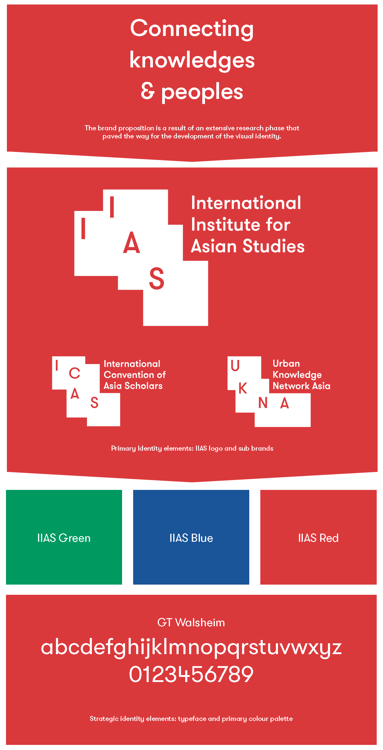
The logo is the most prominent element of an identity. However, to be effective it needs to be supported by a series of design elements. Strategic identity elements comprise of the typeface Walsheim, a modern derivative of Futura, along with three special colours; IIAS red, green and blue. An important condition for the choice of the Walsheim typeface was that it renders in a clear and consistent way the widest possible range of diacritic characters used in modern-day and classical languages.
Effectively disseminating knowledge requires a visual design that maintains its balance while accommodating substantial amounts of content, such as articles and event details, both in online and print formats. Another important feature of the design is that it can be easily transported to IIAS’ subbrands, such as ICAS, HAB and UKNA. With its identity, IIAS communicates its current initiatives and programmes with clarity, assured that all future initiatives will be equally served and enhanced by it.Tactical identity elements embrace the ‘stacking’ principle and include design guidelines for a fluid and original system that is instantly recognised by its visual rhythm and that can be applied across all communication. Adherence to these guidelines is the key to a successful visual identity that will amplify as well as ease communication with the audience and thus help to build the reputation of the IIAS brand. In the case of IIAS, the design is particularly interesting. It is founded on gestalt principles. Boxes overlap one another with lost edges that the brain reads as being there. With the logo, the viewer will see four rectangles although this is not what is physically rendered. These principles are taken further with the use of overlapping framed headings, intro boxes and images.
Gestalt theory
Gestalt theory is based on the idea that our brains will attempt to simplify and organise complex designs and imagery that consist of many elements, by subconsciously arranging the parts into an organised system that creates a whole. Our brains are built to see structure and patterns in order for us to comprehend our surroundings. Gestalt theory comprises of six key principles: similarity, continuation, closure, proximity, figure/ground, and symmetry/order (also called prägnanz, German for ‘good figure’). Prägnanz is the principle we will focus on here. This states that your brain will perceive complex shapes in as simple a manner as possible. The IIAS logo is a clear example of prägnanz. Your brain will interpret the image as four rectangles, even when the outlines of each are incomplete because these are simpler shapes than the actual shape depicted.
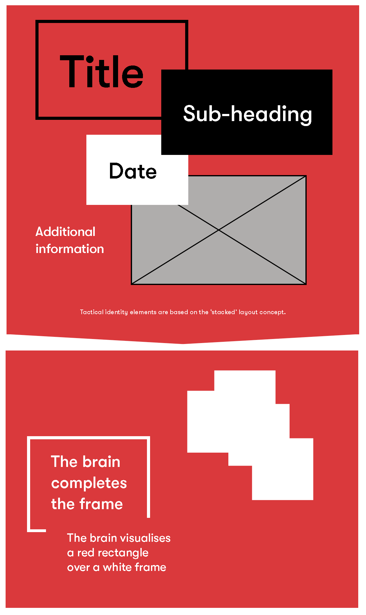
The prägnanz principle. Right: the brain interprets the logo shape as four rectangles. Left: the brain sees two rectangles: a red block in front of a white framed block.
Visual identity
With its visual identity, IIAS has a complete suite of tools that it can fully utilise across all communication. Used intelligently and consistently it has greatly improved brand recognition as well as enhanced people’s experience and interaction with IIAS.
IIAS’ communication efforts are constantly evolving, most recently with the introduction of The Blog and The Channel (our podcast platform). The flexibility and versatility of the design allows for a seamless integration of these new digital additions.
With its identity, IIAS communicates its current initiatives and programmes with clarity, assured that all future initiatives will be equally served and enhanced by it.
Paul Oram is an independent graphic designer responsible for the design and layout of the IIAS Newsletter. Website: https://www.pauloram.nl
Thomas Voorter is the communications coordinator and web manager at IIAS. Email: t.j.h.voorter@iias.nl
Lava team: Noortje Boer, Daan Hornstra, Anton Lamberg, Cecilia Martin and Frank Smolenaers. Website: https://www.lava.nl